
Challenging Characters in Typography
Over the last few days, I worked on the logo for my portfolio site and found myself quite challenged by a simple character - the “H” in my initials.
Did you ever try to come up with a somewhat new1, interesting and also visually pleasing way of constructing an alphabetic character? If so, you will probably have experienced your own preferences for certain letters over others that you might find more challenging. For a long time, I have had the feeling that there are some letters that are much easier to work with than others. For example, working with a “C” or an “O”2 to me is much more difficult, than working with characters like “A”, “K”, “E” etc.
I assume that professional typographers got over this personal preference and appreciate every character for what it is. Imagine, for a second, a group of really experienced typographers and calligraphers. I see gray-haired masters of their craft tracing the perfect line with a sharp pencil or ink-soaked brush and absolute body control. Of course, their minds remain in a fully focused zen-state and therefore detached from the illusion of self and its petty preferences.
If that characterization did not sound particularly convincing and realistic to you, rest assured, it did not to me either. But writing it down helped me realize that probably most professional typographers have not yet attained typographic enlightenment and still might feel a stronger appeal of specific characters. Rethinking this image of advanced typographers (or designers or developers or whichever profession you might feel intimidated by) as still quite human, actually made typography and design appear as more approachable fields of “study” to me again. So a positive side effect of writing this blog post is that it motivated me to learn more about the “theoretical” concepts of typography instead of just going with my gut feeling and my own thinking of and with letters like I have for years.
But back to the challenge a simple character might present you with: After a few experiments with different subjects, I decided to go for a relatively minimalist and a little futuristic logo and since it is for my portfolio site, I came to the conclusion that my initials should be a simple but appropriate choice for what should take center stage in it.
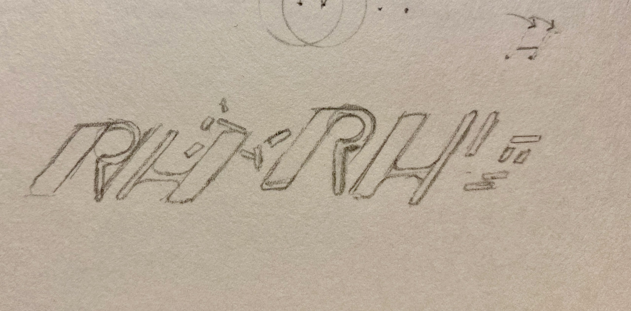
But that is where I encountered the challenging letter “H” (not for the first time of course but with a new intensity). Think about it: the H is such a basic structure - two stems and a crossbar connecting them. And since I had no interest in some blackletter or actual cursive typeface, *that’s it. Just two stems and a crossbar. Additionally, I had to connect it to the R in some way which was an additional challenge since in contrast to the H, the R, to me, is much more versatile. From a dead serious character in a state agency to the playful imaginary fiend of you inner child, the R can take almost any form.
In contrast to that, I browsed the serif and sans-serif sections of open / free font libraries for quite a while to find inspiring new ways to draw an H. But the most variation, I found was the difference in the vertical positioning of the crossbar - sometimes being placed slightly below or above the vertical center of the stems and most often almost exactly at the center.
There I was, sitting at my desk with this uneasy company of letters. How to conciliate the versatility of the R with the austerity of the H?
At first, I thought: “Okay, let’s make them just really bold and set them in italics. But that did not look particularly interesting or recognizable.
Next, I decided to try “forcing” the H into the same regime of experimental proportions, and variable angles that evolved in the iterative work with the R.
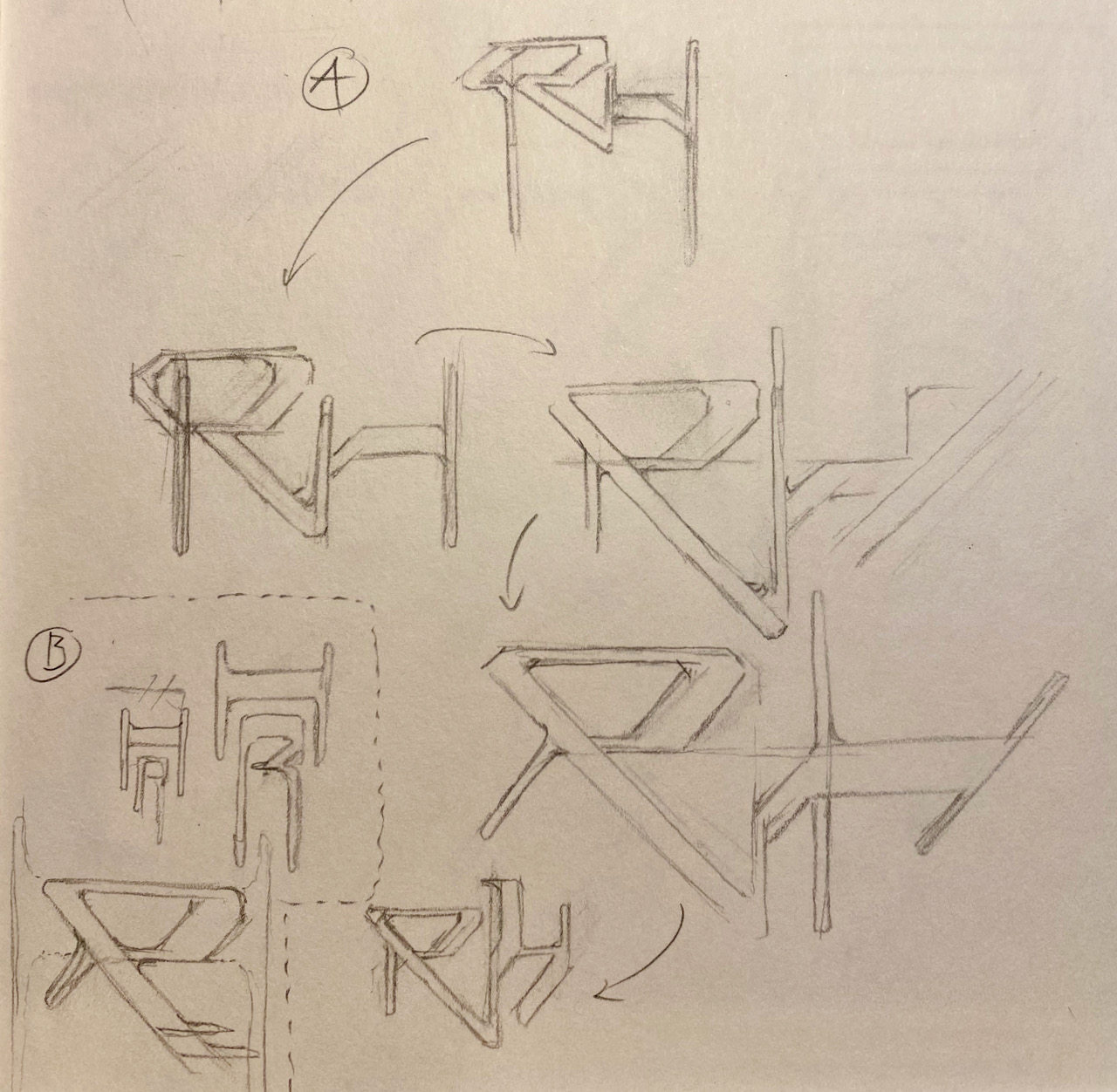
As you can see in the series of sketches labeled with an “A”, the H does not respond well to being subjected to an asymmetrical change in the tilt angle of just one stem. While I think the small sketch at the bottom with just the lower parts of the stems being (partly) tilted while the upper parts are straight, does almost work. It disrespects the fundamental shape of an H too much in my view, though. It almost reminds me of a k in some way. So that did not work either.
In the small sectioned off part of the page above that is labeled with a “B”, I gave in to the prosaic character of the H and made it embrace or almost include the R. I think from a symbolic point of view, this is quite adequate since the H stands in for my family name and I am part of that family, represented by the contained R. But then again, we don’t usually give our initials backwards but are used to reading from left to right and top to bottom (with the Latin alphabet). Not a perfect solution either then…
I wanted to find a solution to this puzzle and got back to the line of thought I started earlier with the series of sketches labeled with an “A”, worked a bit with a buckled crossbar but still had a strange feeling about the anatomy of the H.
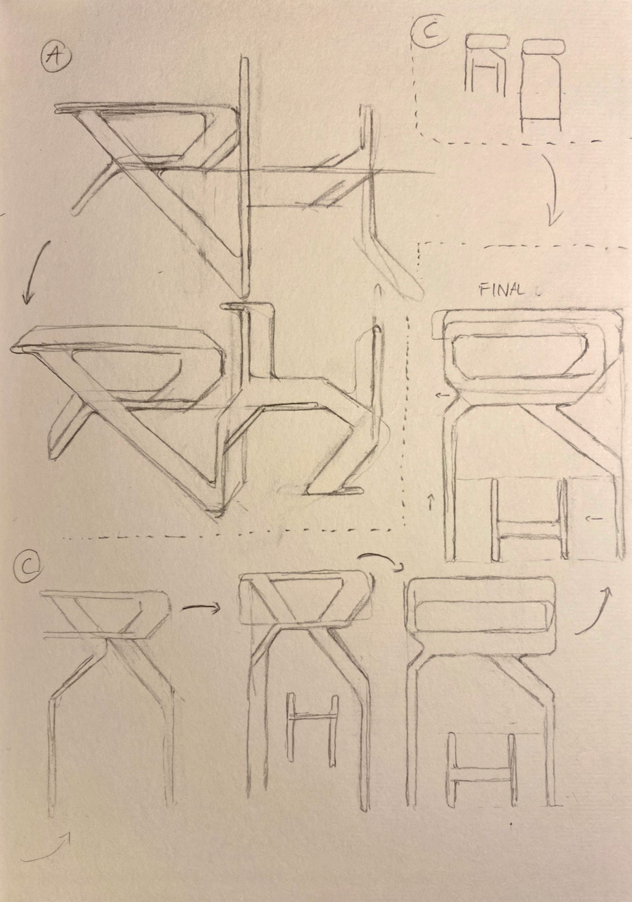
Finally I decided to take up the idea of the vertically semi-nested letters again but this time rearranging the order to the regular first letter on top and second letter below as you can see in the iterations labeled with a “C”. And that is what I felt quite good with. A bit of refinement here and and some work on the proportions there was still needed but I really liked the general idea and layout of this series.
Also, already the small first sketch at the top of the page, brought up an association with Albrecht Dürer’s famous insignia.
Looking up Dürers insignia again, I also recognized that even this great artist, opted for a relatively plain “D” enclosed by an elaborate “A”. Can you imagine the surprise and relieve when I recognized, that a master like Dürer chose a similar approach when presumably faced with a similar problem? Maybe Dürer had totally different reasons for drawing his monogram the way he did but I think D and H are similarly challenging in their respective ways. So after I became aware of the resemblance, I decided to even increase it slightly because I like this kind of reference with reverence and hope it might also work as a kind of sympathetic magic or “Analogiezauber” for my soon to be digitalized logo and work in general.
I will come back to the logo in a later post to also open up the process of transferring this paper and pencil sketch into a vector drawing and ultimately even a subtly animated logo for the portfolio.
-
Of course “there is nothing new under the sun”, as we all now, and probably even less then nothing in a field that has a tradition going back thousands of years. ↩
-
In the case of the “O” you could at least cheat and go for some circular shaped object to substitute the “O” with in a given string. But that is a kind of cheating and wouldn’t be a viable option if you actually want to write text with it instead of just a few charters like you would when lettering a name etc. ↩